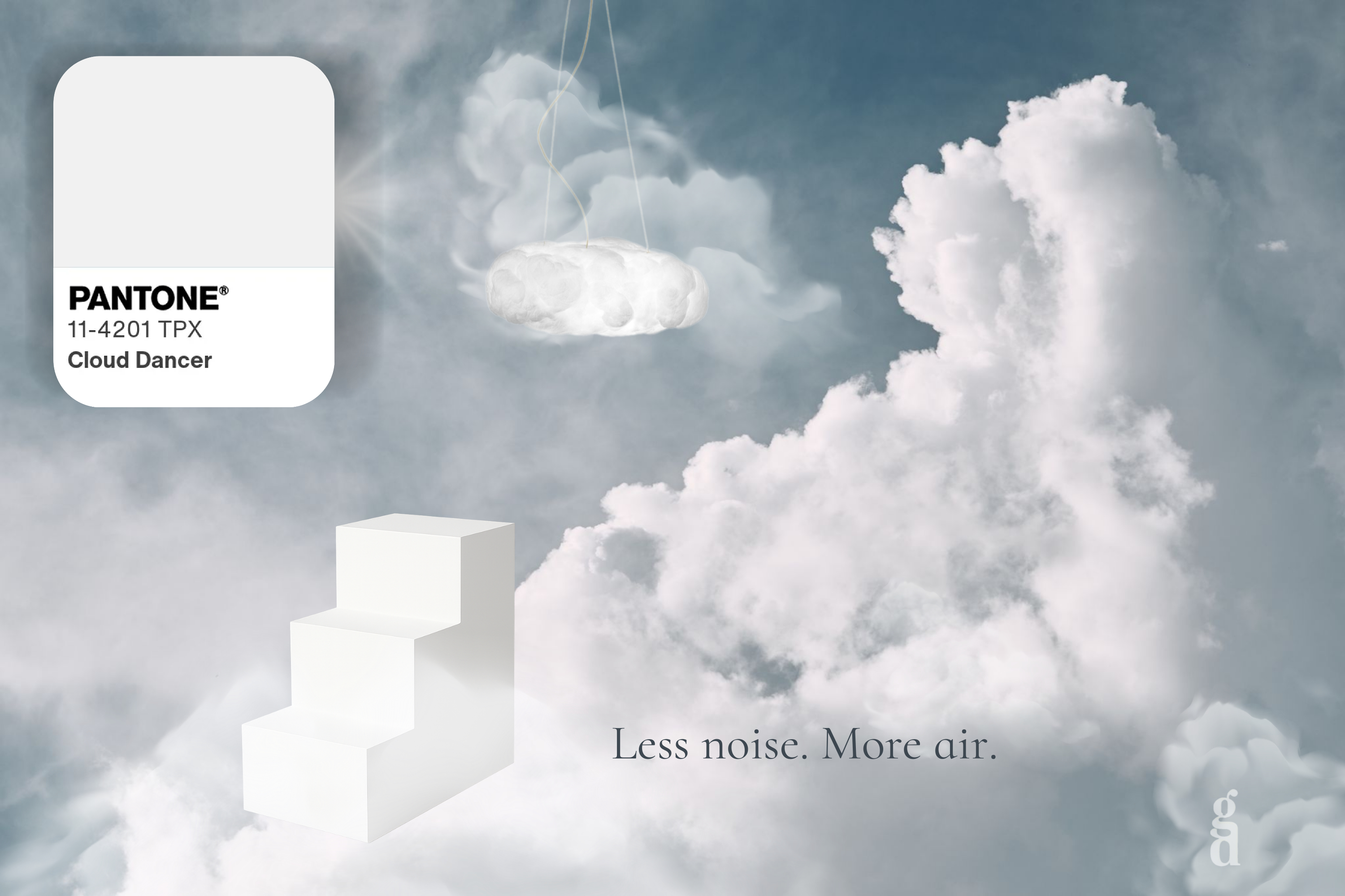
Pantone chose a shade for 2026 that at first glance "is barely visible".
Cloud Dancer 11-4201 – a soft, milky white – doesn't come to dominate. It comes to free up space.
It's a color that looks like the edge of a cloud just before it dissolves into blue.
It doesn't beg for attention.
It just quietly offers: you can have less... and breathe more.
Why Almost-White is a Radical Choice
In an era when the world is bathed in overloaded information, choosing such a quiet shade is surprisingly bold.
Cloud Dancer isn't "just another white for the catalog".
It's a conscious simplification. Fewer signals, less noise, more readability.
It's a return to the essential. It doesn't hide, but reveals – form, gesture, proportion.
It's a reset. A neutral surface you can return to when the visual world fragments.
Pantone indirectly says:
Yes, we live in chaos. And that's exactly why a color that isn't an escape, but a quieting, makes sense.
Cloud Dancer as Stance, Not Shade
We can understand it as a small "protocol":
- I'm setting aside excess. Not everything needs to be seen, not everything needs to be now.
- I'm giving space to air. I don't have to fill surfaces – I can let them breathe.
- I don't want to shout. I want things to work long-term, not just on the first scroll.
Cloud Dancer is the aesthetic equivalent of a deep breath at an open window.
In interiors, on websites, in graphics – almost anywhere you decide what to let be.
How to Bring Cloud Dancer into Life (Without a Shopping List)
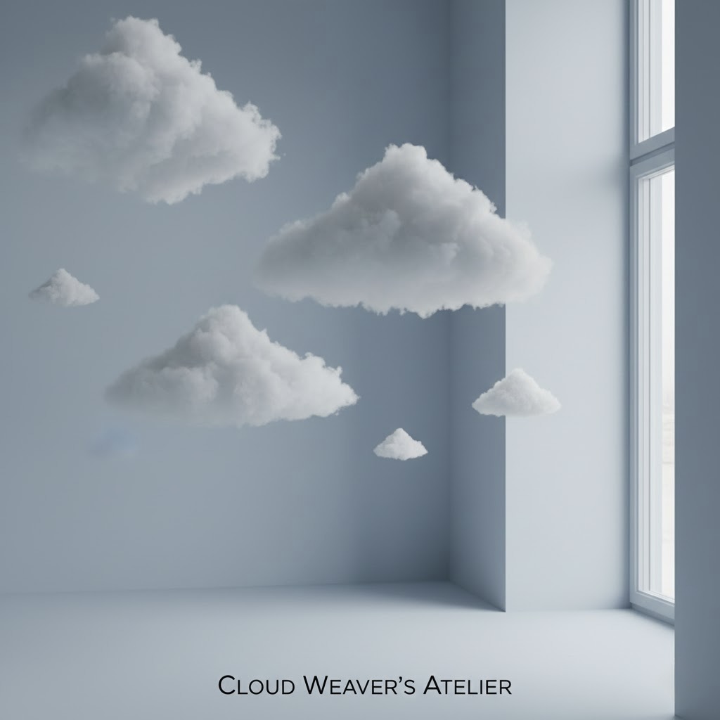
You don't have to repaint your apartment right away. Just a few small "cloud" gestures:
1. One white zone daily
A small ritual: one table, shelf, or work surface where there's nothing but one object you love. The rest disappears from the scene for a while.
2. Clothing as a quiet filter
One "cloud" combo in your wardrobe – a simple white shirt, t-shirt, or pants without logos or text. Sometimes wear it as a visual pause in the week.
3. Paper instead of screen
When your head is overwhelmed, take a clean sheet and write just three things: what really must be today, what can wait, and what can go away completely. Leave the rest empty.
4. Cloud time
A small block during the day when nothing new happens on purpose: no notifications, no extra tags. Just you, light, and breath.
How to Subtly Bring It into Interior
Cloud Dancer isn't about having "everything white". It's about where we allow ourselves less.
Textiles instead of walls
A light almost-white curtain, blanket, or pillowcase that catches and diffuses light. Texture is more important than the shade itself – small irregularity, subtle twill, linen, washed cotton.
One quiet surface
One piece of surface (windowsill, part of wall, shelf) where you don't play with decorations, but with air. Here no accessories compete, just light and shadow.
Contrast with patina
Cloud Dancer works beautifully next to materials with history: wood, stone, ceramics. It doesn't close them off but lets them shine – like a clean frame around an old photograph.
Limited palette
Choose 2–3 colors allowed to live next to Cloud Dancer: perhaps a warm gray tone, light wood, and one accent (inky blue, muted ochre...). Everything else goes to the background.
It's not about "whitewashing" the interior. It's about a few selected places where you can return to the cloud.
What We Take from Cloud Dancer as Designers
The choice of an almost-white color of the year is a signal:
- that the visual world is tired of overload,
- that people seek returns, not more stimulus,
- and that "luxury" today means time, silence, and space – not just another layer of effects.
Cloud Dancer reminds us that design can be an answer to chaos by not enlarging it, but softening it.
"Perhaps the boldest step we can take today is not to add another color, but to remove an old one."