Introduction
Dill Green is a gentle and natural shade of green inspired by the scent and tranquility of herb gardens. In summer 2025, it literally became a hit – and it's not hard to understand why. Its effortless freshness, brightness, and natural elegance make it an ideal choice for kitchens, accessories, and furniture.
Kitchens or accessories in this green create a soothing impression. Dill Green is precisely between calm and life – modern yet warm. When combined with natural wood or cream, it doesn't create a greenhouse effect, but rather the feeling of a quiet botanical gallery.
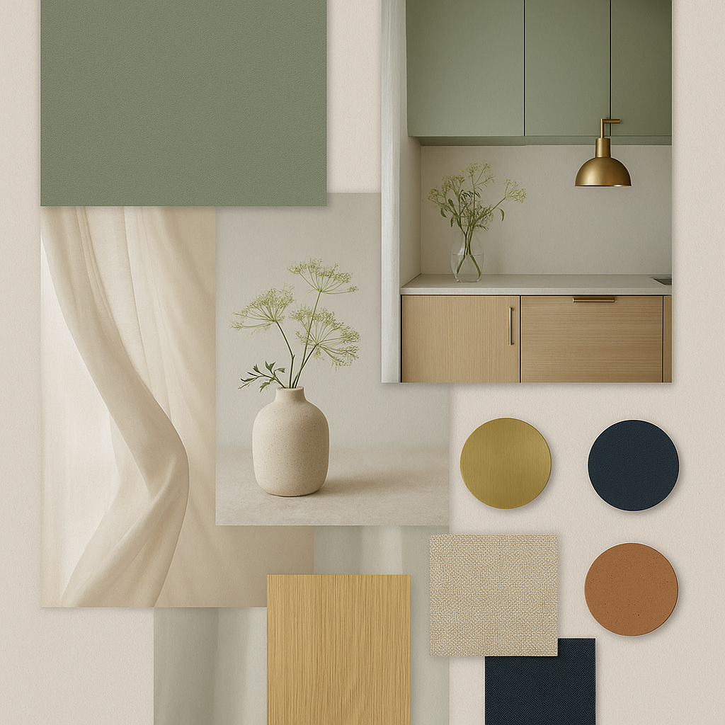
Mini palette: Dill Green – Quiet botanical gallery
1. Neutral support – calm and elegance
- Creamy white (gently warm) – balances the green so it doesn't feel cold.
- Warm gray (sandy, light taupe) – anchors the space without harshness.
2. Natural accompaniment – depth and texture
- Natural oak / light wood – highlights botanical character while staying modern.
- Terracotta (muted, more brick-like) – adds energy and works as a warm accent.
3. Metal tones – touch of luxury
- Brass / old gold – warm shine that adds sophistication without ostentation.
- Matte copper – gentle elegance, beautiful in lighting or accessories.
4. Accent colors
- Ochre yellow (muted) – sunbeam in natural tone.
- Ink blue – contrast that highlights green and modernizes it.
Why it works
Dill Green is a chameleon – calm in natural combinations, noble with metal, modern with bold accents.
If you don't want to change the entire space, just give the kitchen island a new coat in this shade and it immediately becomes the focal point, creating contrast without overwhelming the room.
Usage tips
- Use as a base, not as a shout. Dill Green is gentle and appears more neutral than vibrant emerald.
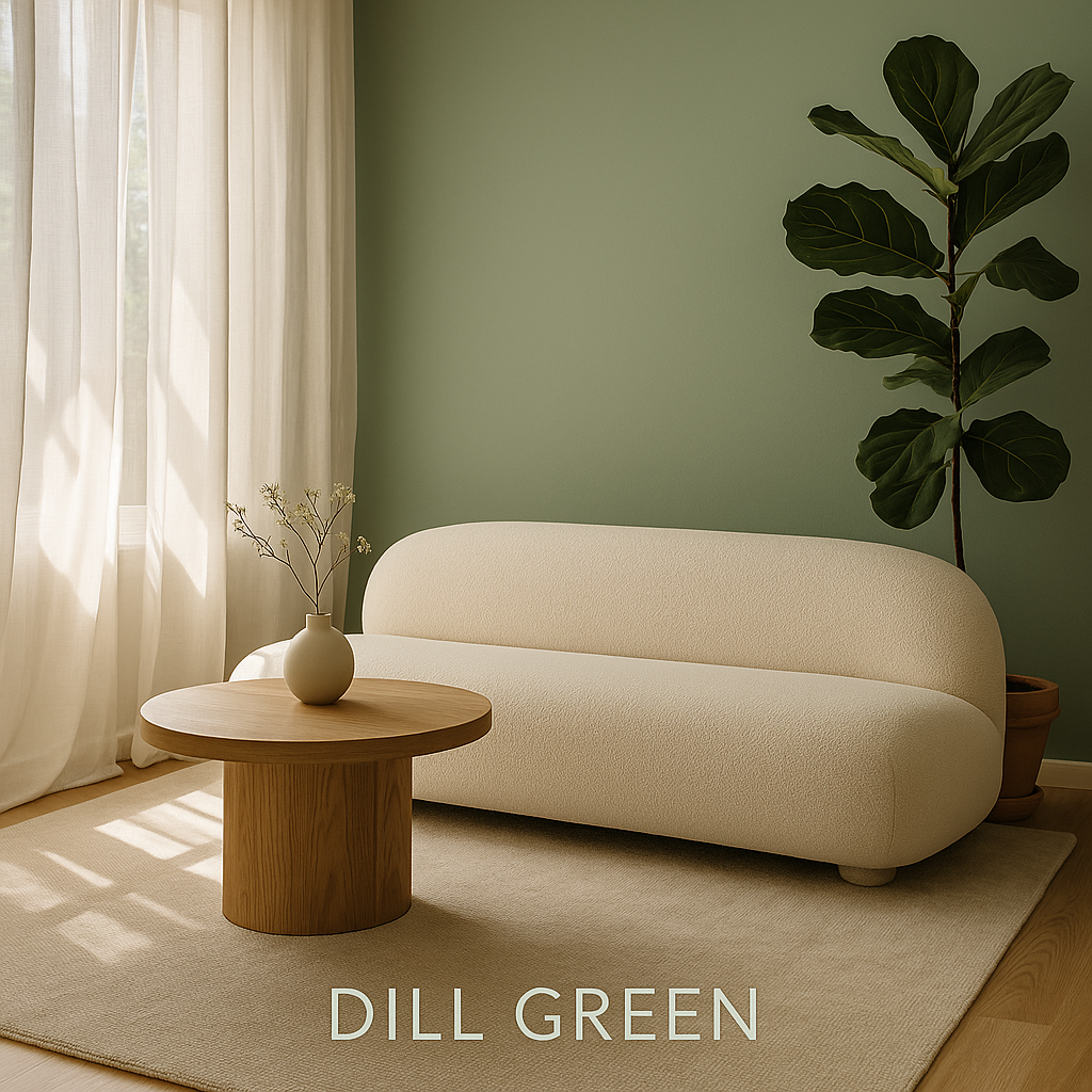
- Enliven with textures or zones. For example, a green wall complemented by natural wood, shelves, art, or curtains – eyes never perceive just color, but the entire context.
- Add warm accents. Gold, brass, light wooden frames – warm the tone of green and soften its coolness.
- Let it breathe. Don't put it on all walls – one main surface, the rest neutral shades.
And when it gets old?
Dill Green adapts easily – it can be complemented with a painting, wallpaper, or wooden cladding on part of the wall. One wall in Dill Green functions as a living canvas.
In smaller rooms, full-surface green can feel heavy, but the "one wall + gold accents" variation is timeless and airy.