Design doesn't always have to decorate.
Sometimes its task is to hold a dialogue — quiet, focused and deeply personal.
There are bottles you pick up for the variety.
There are bottles you pick up for the winery.
And then there are bottles you reach for without knowing why.
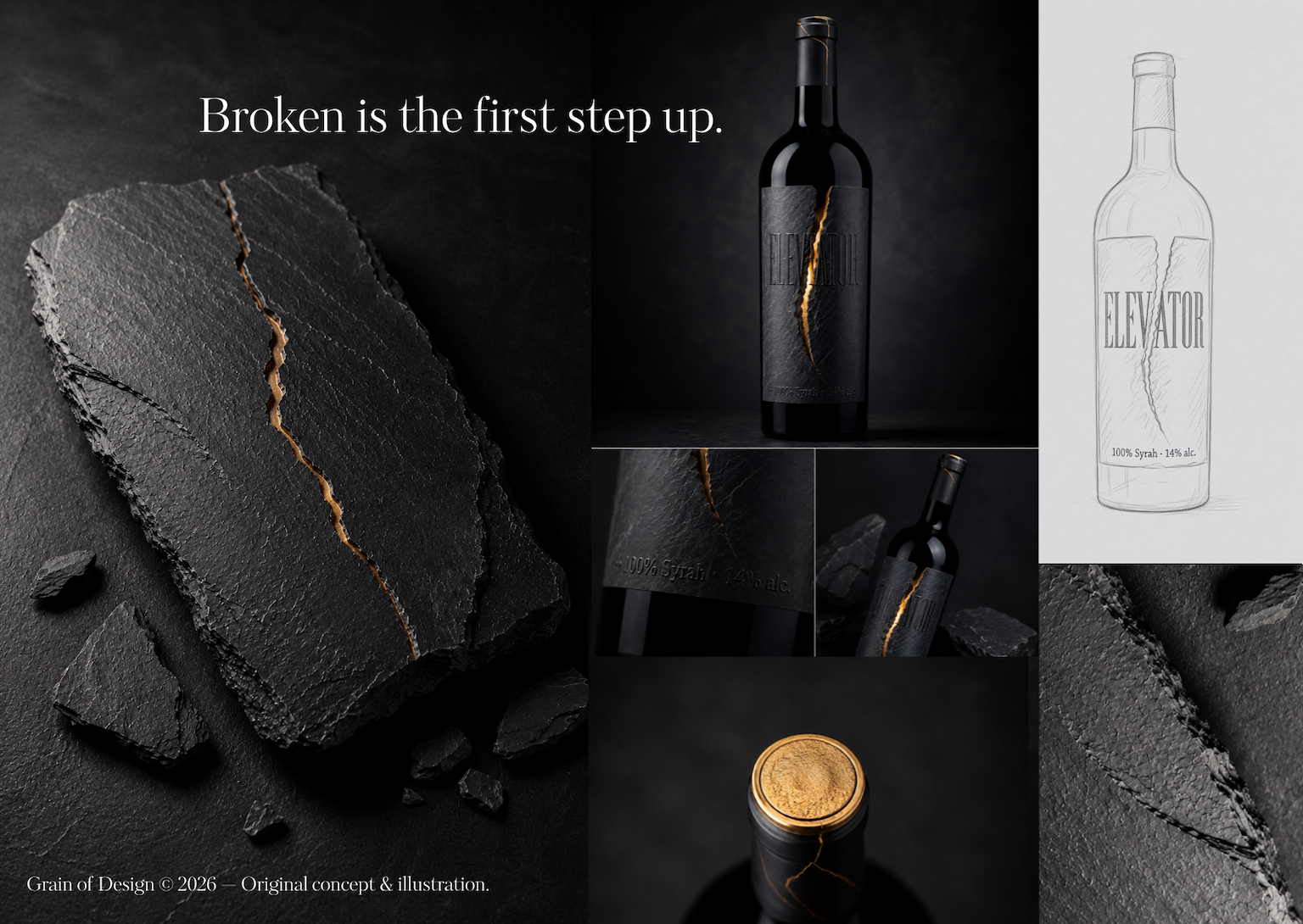
The ELEVATOR™ concept was born from exactly this idea. It has no desire to be another striking label on the shelf. It wants to create a moment of stillness. A moment when you stop looking for information and begin to sense the material, the light and the silence.
Why It Was Made
Some materials age.
Some materials crack.
And some cracks deserve to remain visible.
ELEVATOR was born as an original experiment within our internal laboratory, Grain FutureLab.
We were searching for an answer to the question of how to create packaging that would not compete with the surrounding visual noise, but offer its opposite — calm, simplicity and space for personal interpretation.
It was made for people who do not seek an escape from reality in design, but a deeper experience of it.
"Some designs want to be seen. Others want to be held."
The Design Journey
ELEVATOR was not made in a single afternoon.
The first drafts were considerably more complex. They contained more layers, more effects and more visual gestures.
Gradually, however, we began removing individual elements one by one.
A single idea remained.
Stone.
Light.
A fracture.
The fewer elements the design contained, the stronger it became.
Minimalism was not the goal here. It became the result of a long process of decision-making.
The Concept
The core idea rests on the symbolism of the vertical and upward movement.
The name ELEVATOR does not refer only to a physical lift. It represents the inner movement of a person towards what is most essential.
The dominant element of the entire label is a deep vertical fracture cutting through an otherwise seamless monolithic surface.
It is not a symbol of failure.
It is a symbol of transformation.
It is the place through which light penetrates darkness.
It reminds us that it is often through obstacles, experiences and our own fractures that we discover what is strongest within us.
How It Works
The physical experience of the design rests on the contrast of materials and tactile sensation.
The front of the bottle is covered in a specially textured paper reminiscent of natural slate.
The matte, subtly ridged surface creates the illusion of real stone.
The centre of the label is cut through by a realistic geological fracture, beneath which a muted golden light appears.
This is not decoration.
It is the single moment in which the design allows the material to "speak".
The embossed ELEVATOR logotype rises directly from the slate surface and the golden detail continues up to the capsule of the bottle, binding the entire object into a single visual gesture.
What Makes It Different
ELEVATOR works with radical minimalism.
On the front you will find no vintage, no variety, no superfluous graphic elements.
All technical and legal information remains on the back label.
Minimalism here is not an aesthetic decision.
It is the means by which the material, the light and the object itself are allowed to stand out.
The bottle therefore does not function as a carrier of graphics.
It functions as a monolith.
Material
Label
A specially textured paper imitating natural slate.
Surface
A matte, prominently embossed surface complemented by a delicate golden line concealed within the vertical fracture.
Philosophy
ELEVATOR rests on the belief that design does not have to be loud to be powerful.
It can be quiet.
It can be tactile.
It can tell a story without a single image.
Conclusion
ELEVATOR was not made to demand attention at any cost.
It was made to stop someone for a moment.
So that instead of another label, they might discover a story hidden in the material.
And perhaps be reminded that some fractures are not an ending.
They are a beginning.
Broken is the first step up.
Prototype note
We'd love to hear your thoughts
This concept was created in our creative laboratory, Grain FutureLab.
Does this idea resonate with you? Would you like to encounter packaging like this on a shelf in a wine shop? Do you have ideas for further material variants or a continuation of this collection?
We welcome every response. Write to us via the contact form at grainofdesign.cz.
Thank you for searching with us for beauty even where most people walk past.
Production & publication
Interested in bringing this concept to life?
ELEVATOR™ is an original concept created within Grain FutureLab. If you are looking for distinctive packaging for a winery or beverage brand, this design can be developed further, adapted to a specific product and prepared for production.
For enquiries, please contact us via the contact form at grainofdesign.cz.
The ELEVATOR™ concept has been published on the international platform Packaging of the World, which showcases a curated selection of inspiring packaging projects from around the globe.
View project on Packaging of the World →Wine for those who don't drink to forget — but to remember.